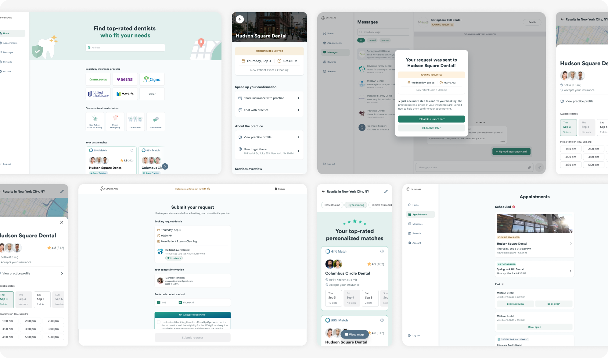
Project summary
For many, booking a dental appointment comes with uncertainty: choosing a practice they can trust, understanding insurance requirements, knowing whether an appointment is confirmed, and figuring out what to do before their visit.
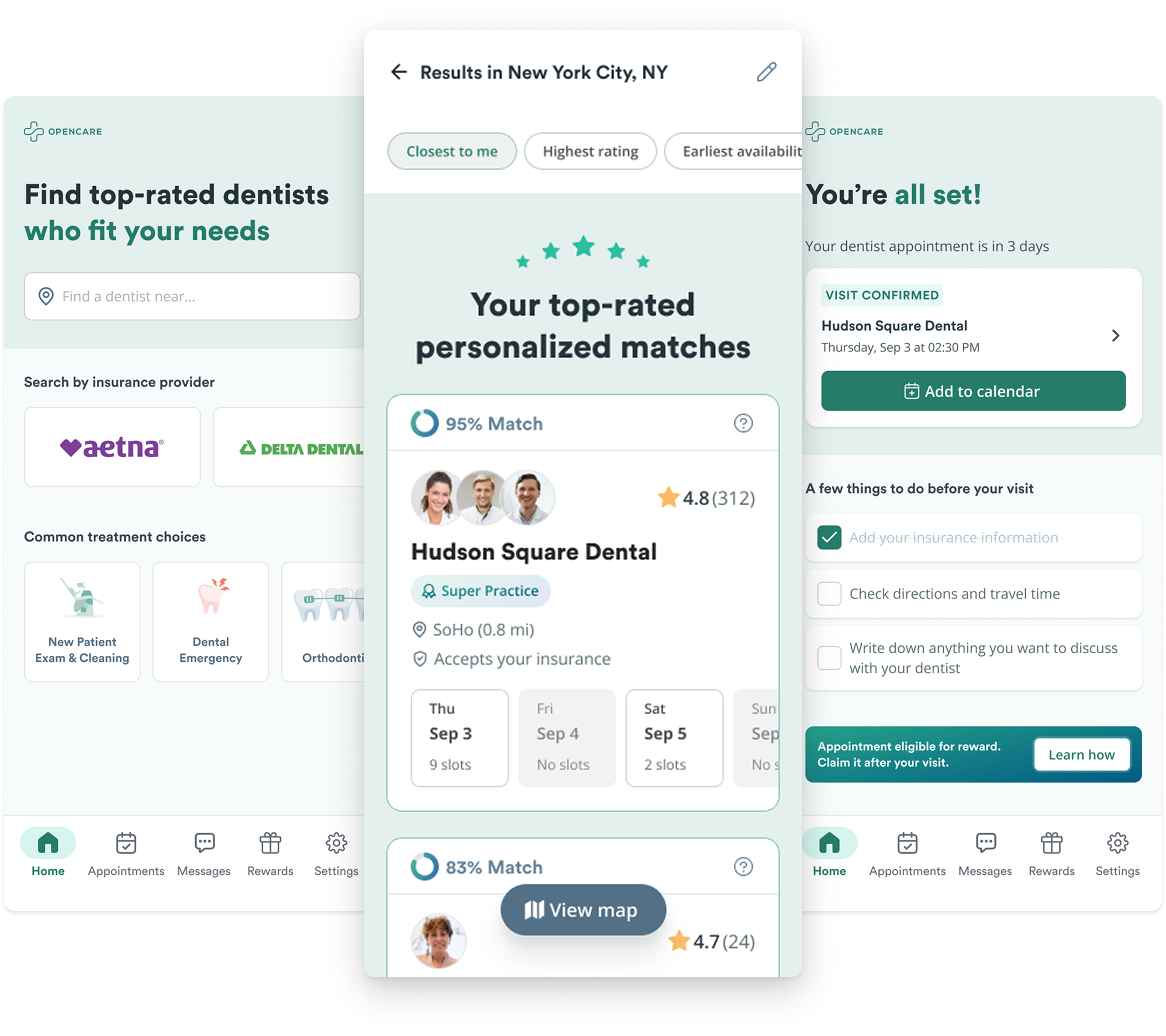
In that sense, I contributed to the evolution of the Opencare Patient App from a primarily appointment-focused experience into a more connected journey, bringing clarity and continuity between discovering care, requesting an appointment, and preparing to attend.
01
The problem
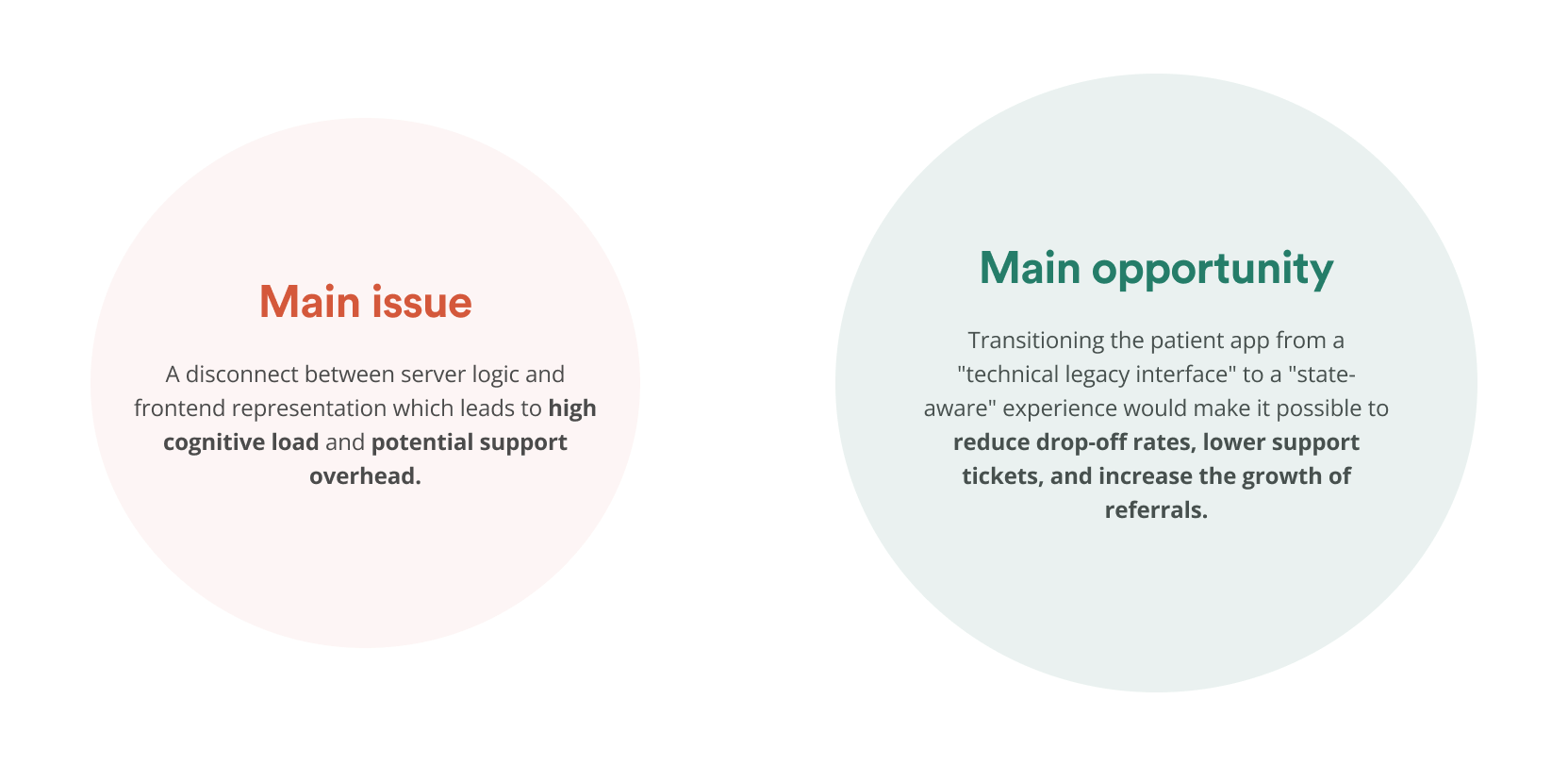
The existing Patient App offered a robust set of capabilities, but important interactions weren't quite adapting to the patient's progress: appointment statuses weren't always communicated accurately, completed actions could leave irrelevant elements behind, information sometimes competed for attention, all while simple tasks required more steps than necessary.
These issues weren't always obvious when evaluating individual screens. They became more significant when looking at how the experience behaved across different stages of the patient lifecycle.
This raised a larger question: How might we shift from a feature-driven interface to an experience that responds to where patients are in their care journey?
02
Looking beyond inconsistencies
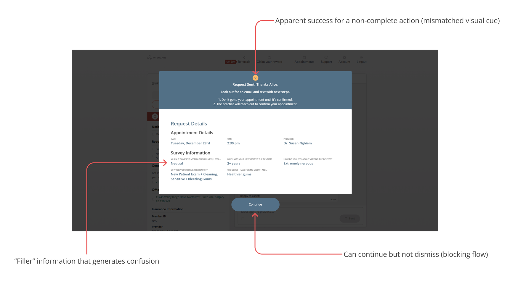
I conducted a macro-level UX audit to examine how the existing app supported patient tasks, communicated system states, and maintained consistency across its core features.
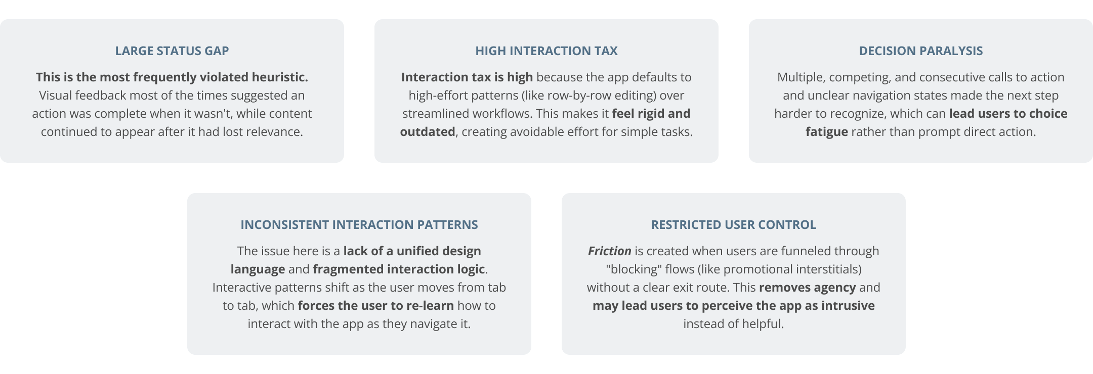
The audit focused on three complementary areas: cognitive heuristics, structural logic and interaction costs, and accessibility considerations around improvements in critical components outside the newer design system.
Rather than treating every inconsistency as a separate defect, I looked for patterns that could reveal deeper problems in the product's interaction model:
03
How to improve the core experience
The audit and complementary desk research helped me establish a more focused direction for the redesign.
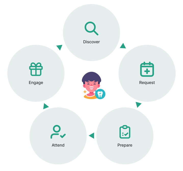
Instead of adding features to address isolated moments of friction, the opportunity was clear: to improve the underlying experience by designing around the patient lifecycle.
By making the interface responsive to each stage of care, and introducing value at the right moments, the goal then was to evolve the Patient App from a transactional tool into a more intuitive and supportive experience.
04
The redesign process
The redesign began by examining not only how the Patient App looked, but how it behaved across different stages of the patient journey:
Translating insights into actionable priorities
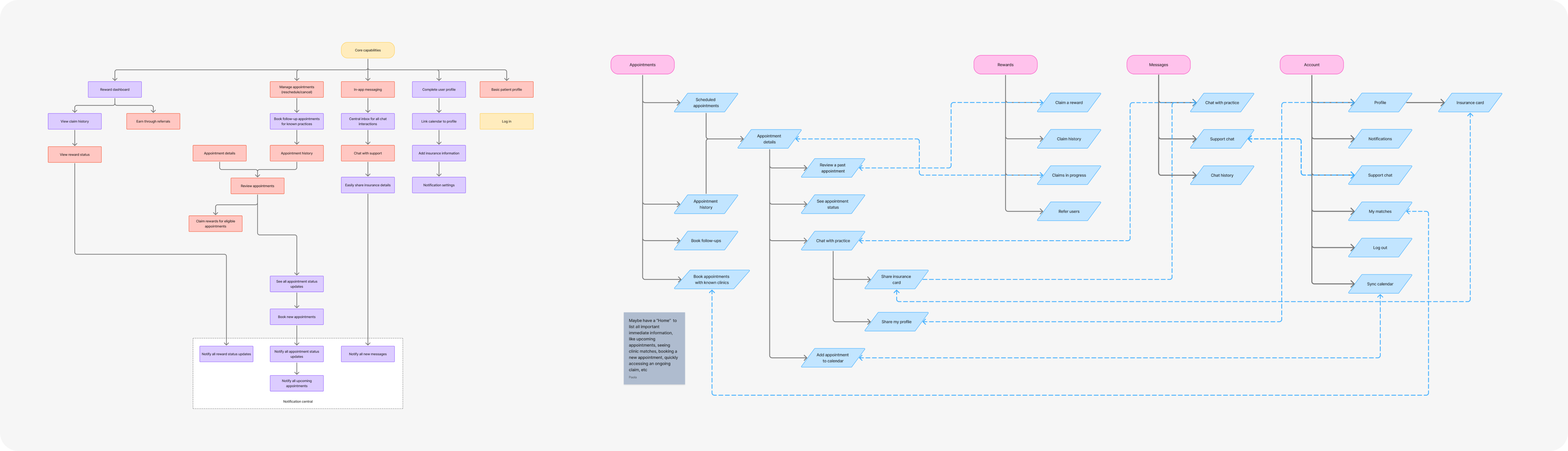
I started by documenting the existing patient journeys and breaking down the most critical friction points into actionable design tasks. Each task outlined the problem, its impact on users, proposed improvements, and acceptance criteria.
This helped prioritize foundational issues like navigation, appointment status clarity, and unnecessary interaction costs.
Rebuilding the core
With priorities established, I began redesigning the interface and interaction patterns across mobile and desktop. Beyond the visual overhaul, I reworked core flows focusing on creating a consistent, predictable experience that could adapt to different patient states.
Expanding the experience
I went beyond appointment management to address how patients discover, book, prepare for, and follow through with dental care.
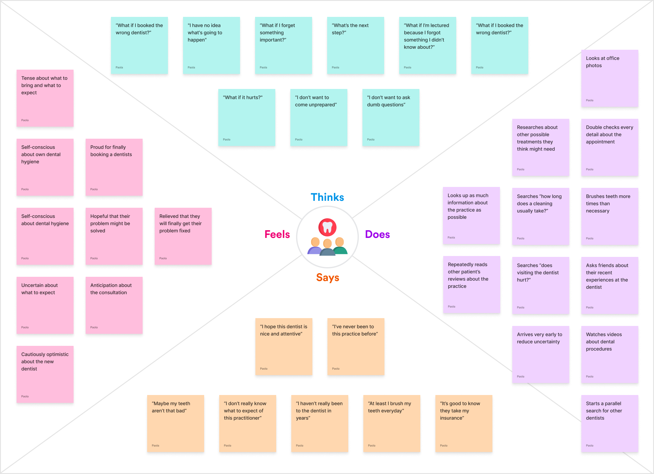
I explored new in-app discovery and checkout experiences, redesigned post-booking guidance, mapped notification journeys, and researched pre-appointment anxiety to better understand patients' needs between booking and attendance. This helped connect previously isolated interactions into a more supportive care journey.
Connecting and validating the journey
After the new core experience was defined, I developed an end-to-end interactive prototype connecting discovery, dentist selection, checkout, appointment requests, and pre-appointment preparation. Rather than evaluating individual screens, this prototype allowed me to explore how information, interactions, and expectations carried across the entire experience.
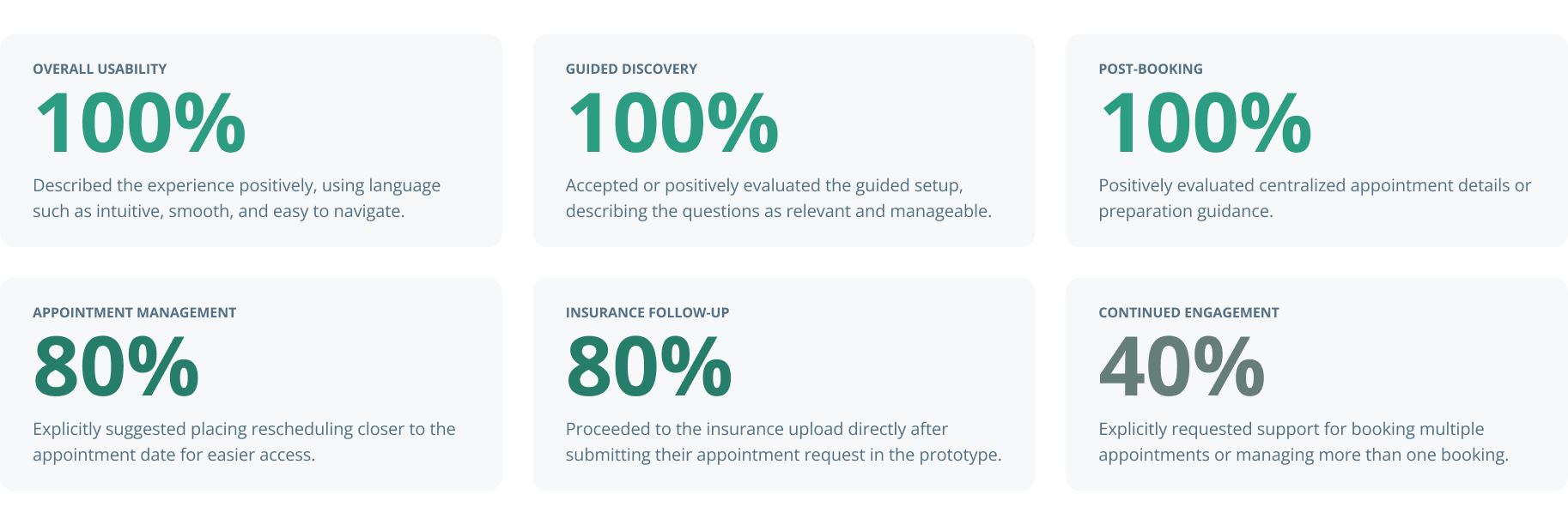
I used this prototype to conduct moderated, prototype-led interviews with real users to evaluate the redesigned journeys. Through observed behavior and open feedback, I identified what felt intuitive, where patients hesitated, and which interactions still created uncertainty.
The research provided positive signals about the overall experience while revealing opportunities to improve rescheduling and information continuity.
Continued improvement
I synthesized the research findings into a prioritized design backlog, organizing issues by severity, journey stage, and supporting evidence. This created a clearer path for future iterations, shifting design decisions from assumptions toward observed patient needs and measurable product objectives.
Wrap up
Turning debt into opportunity
One of the most important takeaways was recognizing that improving an experience doesn't always mean building more, but instead, reshaping what's already there to begin with.
The UX audit and research shifted my focus away from isolated interface refinements and toward a broader understanding of how the app should behave across the patient lifecycle to deliver a better experience altogether, while preserving business objectives.
The goal was no longer just to help users complete a booking. It was to design an experience that understood their needs, their progress, respected their time, and supported them throughout their entire care journey.