Project summary
LensLock Inc. is an American company that develops law enforcement technology, specializing in body-worn and dashboard cameras for police use.
I led the redesign of their Evidence Management Locker, a critical platform for law enforcement agencies that use LensLock equipments. The outdated interface was creating friction for both users and the sales team, so I focused on modernizing the UI, simplifying workflows and improving usability, aiming to strengthen brand trust and support future growth.
01
The problem
- Outdated UI: The design failed to meet modern usability standards, resulting in frustration and inefficiency for end-users, for both web and mobile platforms.
- Sales barriers: The complexity of the evidence locker created friction during demos and new-user onboarding, making it harder for the sales team to close new camera deals.
- Impact on customer retention: Dissatisfaction with the UI raised the risk of churn among existing customers.
02
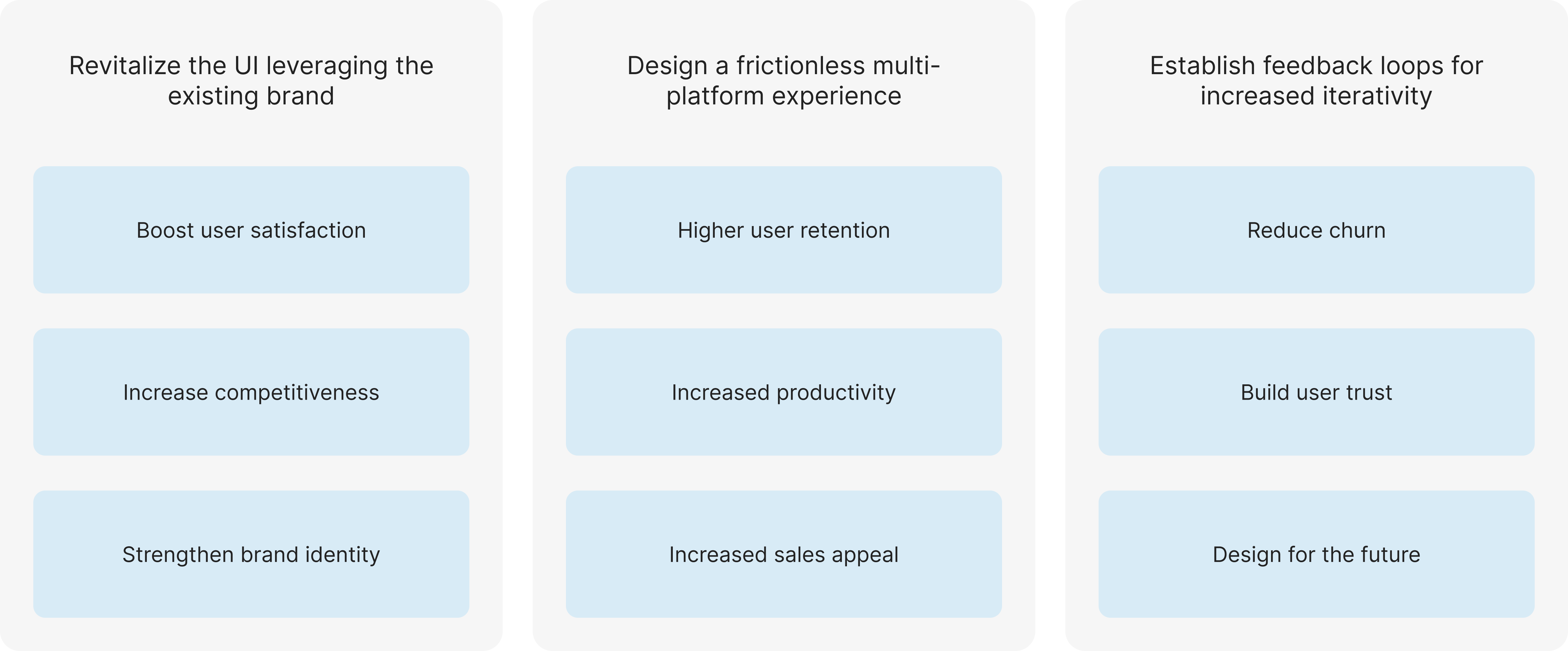
Perceived opportunities
Addressing UI challenges on both web and mobile platforms would unlock opportunities to provide a cohesive, engaging experience. Streamlined workflows would improve retention and demos, while feedback loops would proactively address pain points and drive continuous, insight-based improvements.
03
Validation
To ensure the redesign tackled real user and business challenges, I conducted a mix of qualitative and analytical research:
- Stakeholder interviews (PM, Sales team);
- Market study and trend benchmarking;
- Competitive analysis of similar platforms;
- Usability heuristics and design pattern evaluation.
Together, these inputs shaped design priorities and helped me balance business objectives with user needs.
.png)
04
Process & Challenges
Many challenges surrounded this project, beginning with the fact that there was no real north or linearity to the process, with little to no prioritization or structure.
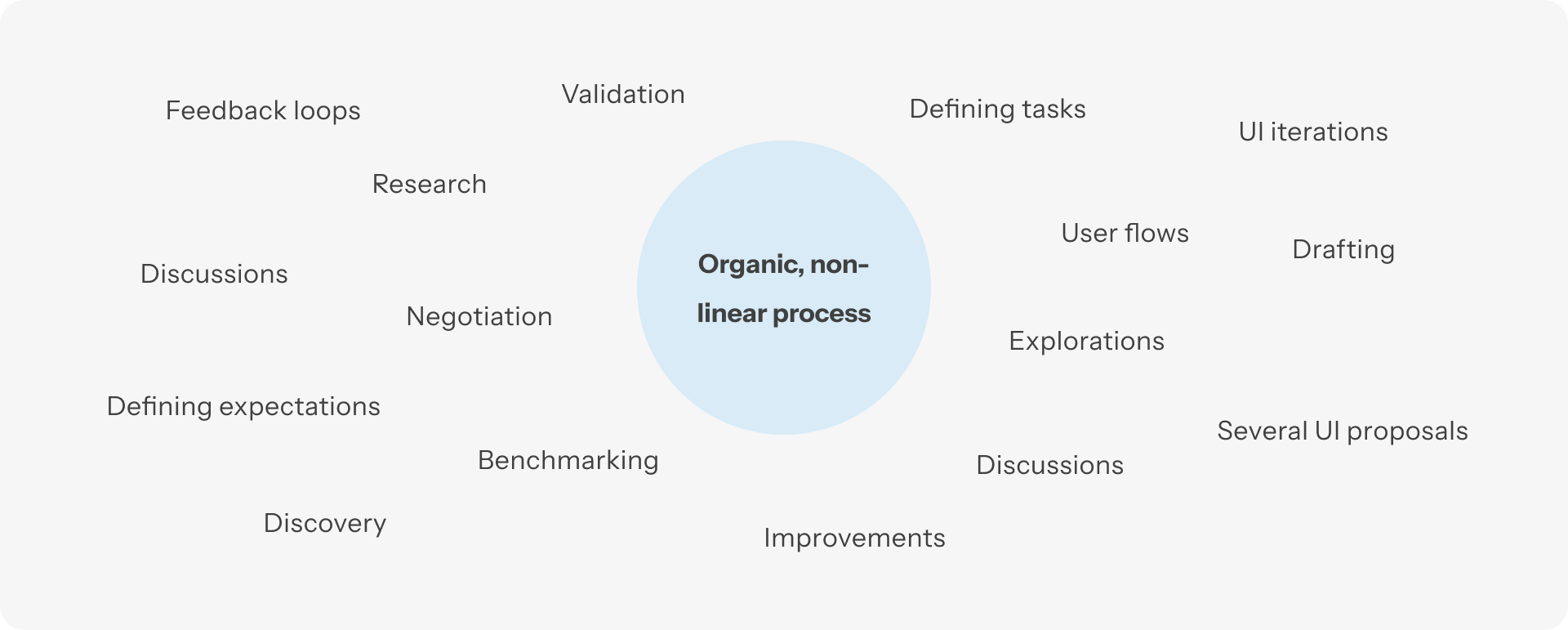
While improving workflows was identified as an opportunity, there was little room to make it happen due to top-down management, and even the PM had limited space to negotiate scope. As a result, many tasks unfolded simultaneously: researching the product, analyzing competitors, gathering input from the sales team, drafting based on design patterns with minimal feedback, and conducting usability studies to ground future improvements. On top of that, the absence of testing resources meant I had to rely heavily on heuristics and stakeholder feedback.
Although difficult, this overlapping process required flexibility, allowing me to revisit earlier stages and continuously iterate on solutions as new insights emerged.
05
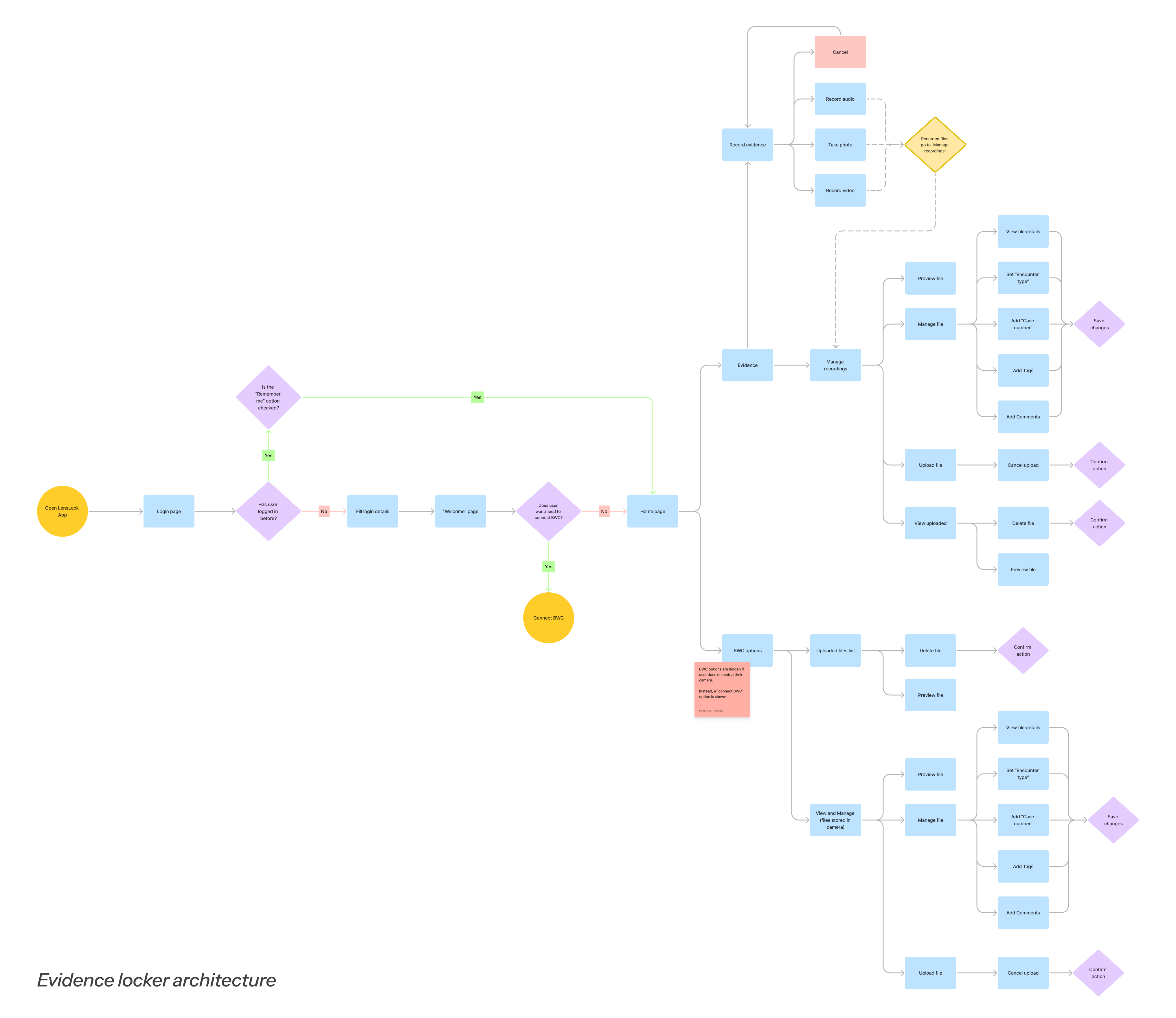
Evolution & Deliverables
The redesign process unfolded through several iterations, moving from early drafts and wireframes toward refined flows and polished interfaces. I began by restructuring user flows to reduce complexity and bring clarity to navigation. From there, I created low-fidelity wireframes that helped visualize new interaction patterns and align expectations with stakeholders.
These evolved into multiple rounds of UI proposals, each iteration addressing feedback and usability principles to gradually improve readability, accessibility, and visual consistency.
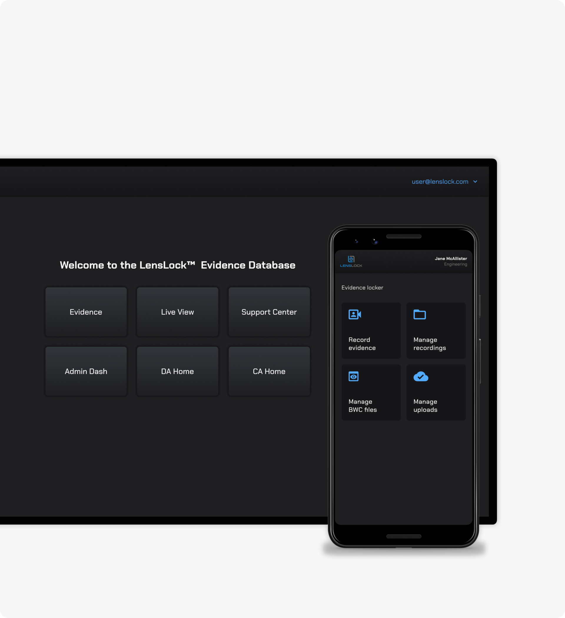
My work culminated in high-fidelity prototypes for both web and mobile platforms, introducing a modern look and feel based on the company's branding guidelines, which were non-negotiable.
Together, these deliverables not only modernized the product but also established a foundation for continuous improvements and future feature development.