Project summary
Laud.Ai is a web-based AI tool that automates the transcription of radiology reports, helping professionals save time and reduce manual work. When I joined the project, the product was already functional but lacked both a user interface and a cohesive brand identity.
As the product designer, I developed the brand from the ground up and conducted initial user research to guide the product’s evolution. My goal was to translate complex functionality into a clean, intuitive, and trustworthy experience tailored to radiologists’ workflows.
The result was a refined interface and visual identity that reflect innovation, reliability, and clarity, aligning with Laud.Ai’s core mission.
01
Brand concept
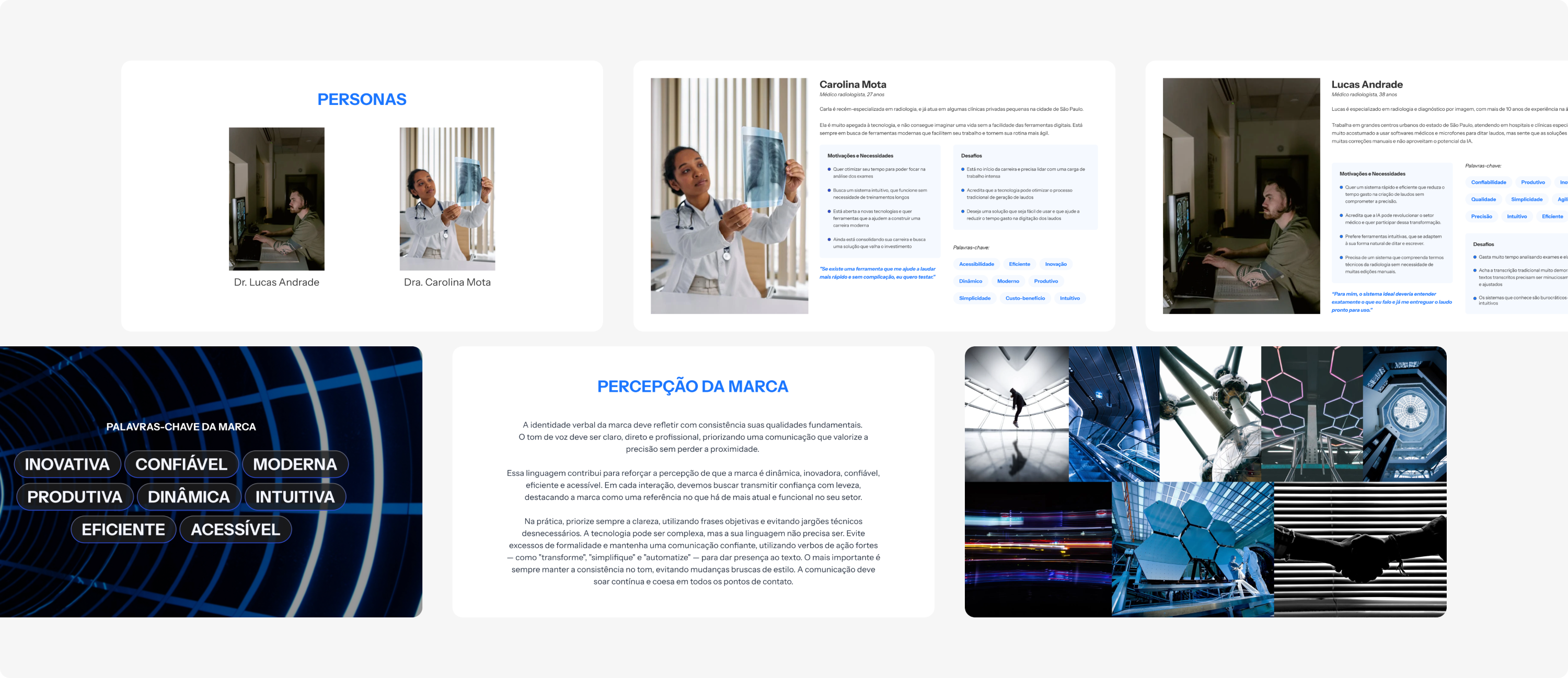
The first phase focused on defining the brand essence for Laud.Ai. The goal was to create an identity that communicated innovation, reliability, and clarity, aligning with both AI-driven technology and the precision required in medical contexts.
This phase was highly conceptual and focused on translating the client’s vision into something tangible. They had a clear sense of the desired look and feel, which made discussions flow naturally. After defining the personas, I led a series of brainstorming sessions to establish brand keywords and, from there, developed the first set of visual guidelines.
02
Naming
The name Laud.Ai was born from the fusion of the Portuguese word “laudo” (meaning medical report) with the English abbreviation for Artificial Intelligence. The result is simple, direct, and descriptive of what the product does: an AI tool for radiology report transcription.
Interestingly, “laudai” is also the simple past of the Italian verb laudare (to write official reports), which adds an extra layer of sophistication and linguistic resonance.
This blend of meanings perfectly captures the brand’s essence: intelligent, human-centered, and effortlessly clear.
03
Visual exploration and
logo design
I researched visual trends in AI and health tech to find a balance between credibility and modernity, aiming to reflect both precision and intelligence while keeping the design approachable. This exploration covered logo concepts, color palettes, and typography combinations aligned with the brand’s key attributes that had been defined so far.
The final logo reflects Laud.Ai’s core principles of clarity, innovation, and precision. Its clean geometry and rounded terminals convey both reliability and approachability, reinforcing the brand’s balance between technology and empathy.
04
Color palette
The palette combines blue and green tones to convey technology, trust, and growth.
Blue reinforces reliability and professionalism, whilst green adds balance, renewal, and a sense of calm. The subtle bluish-purple accent adds a touch of modernity and innovation, resulting in a cohesive and energetic system that feels both contemporary and approachable.

05
Heuristic analysis and UX audit
Before moving into design, I conducted a usability and experience audit of the existing platform. At that stage, Laud.Ai had a working backend and a fully-functional AI transcription system, but no defined interface or user experience. The audit was based on usability heuristics, complemented by a review of all existing interaction flows, information hierarchy, and UX writing and design patterns. It also included benchmarking against other AI and health tech platforms.
The audit revealed key issues such as inconsistent patterns, lack of error prevention, unclear system feedback, and no onboarding support. These findings highlighted clear opportunities to enhance usability, trust, and engagement, guiding the foundation for the product design.
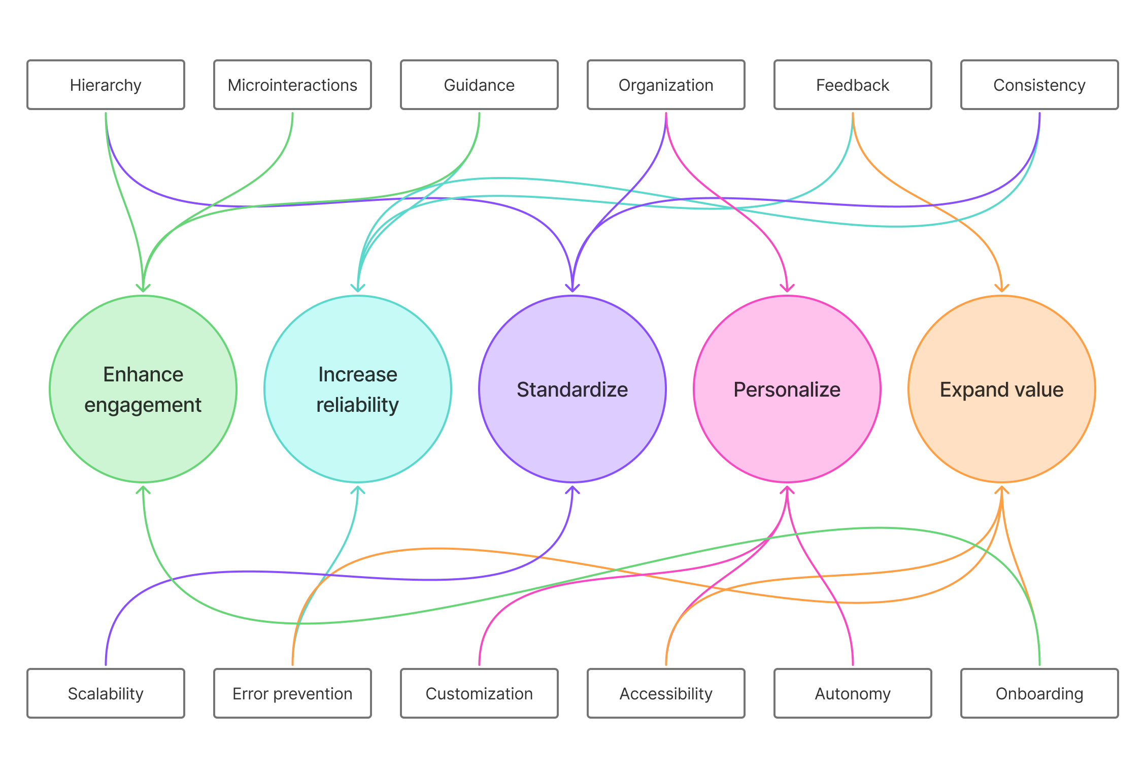
Expected benefits
These improvement opportunities were mapped out to generate real value for both user and business, including:
• Increased user satisfaction and trust (CSAT / NPS)
• Reduced onboarding time and support costs
• Higher retention and engagement rates
• Improved task efficiency and accuracy
• Stronger brand perception and competitive positioning
06
UI development
Building on the findings from the audit, the next step was to translate those insights into tangible design.
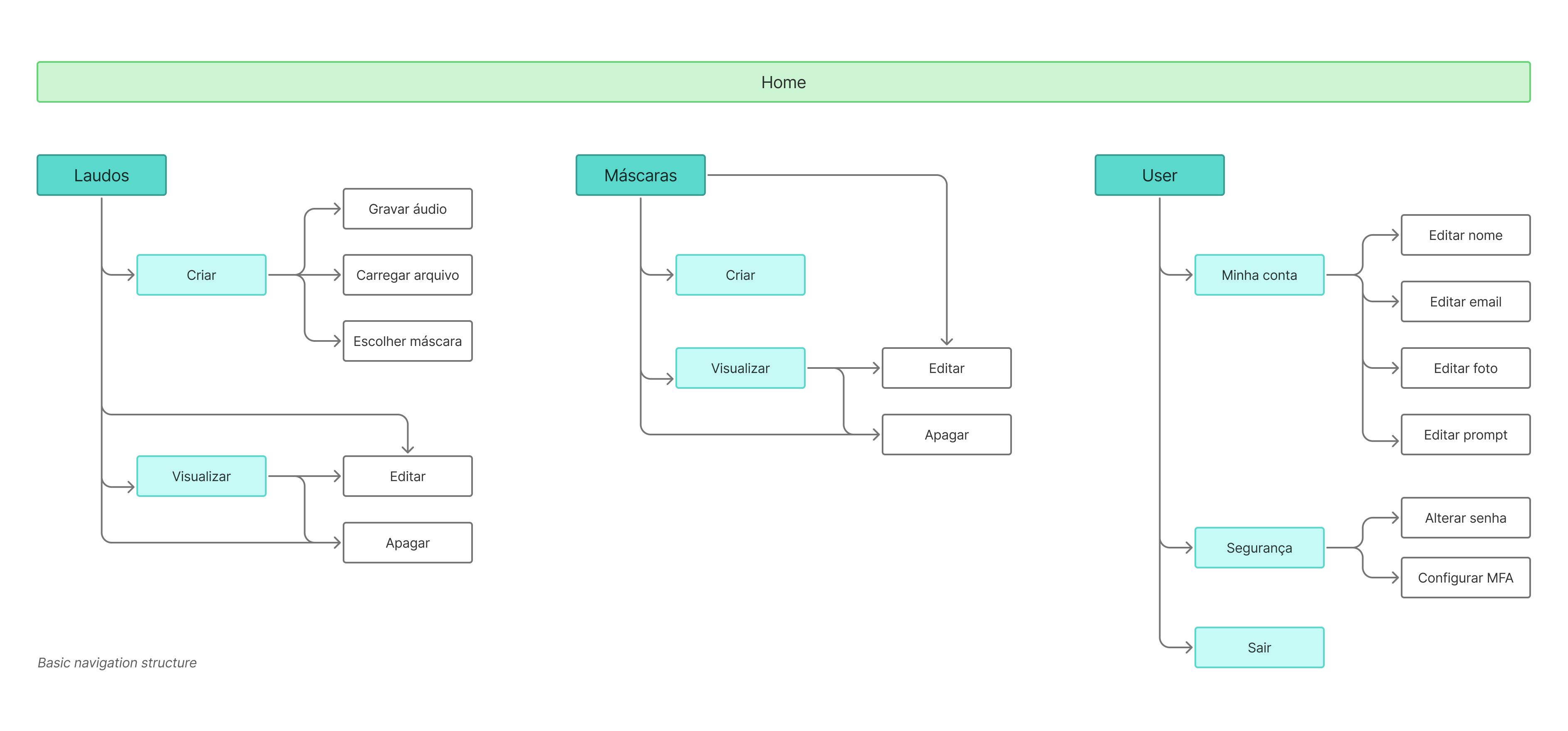
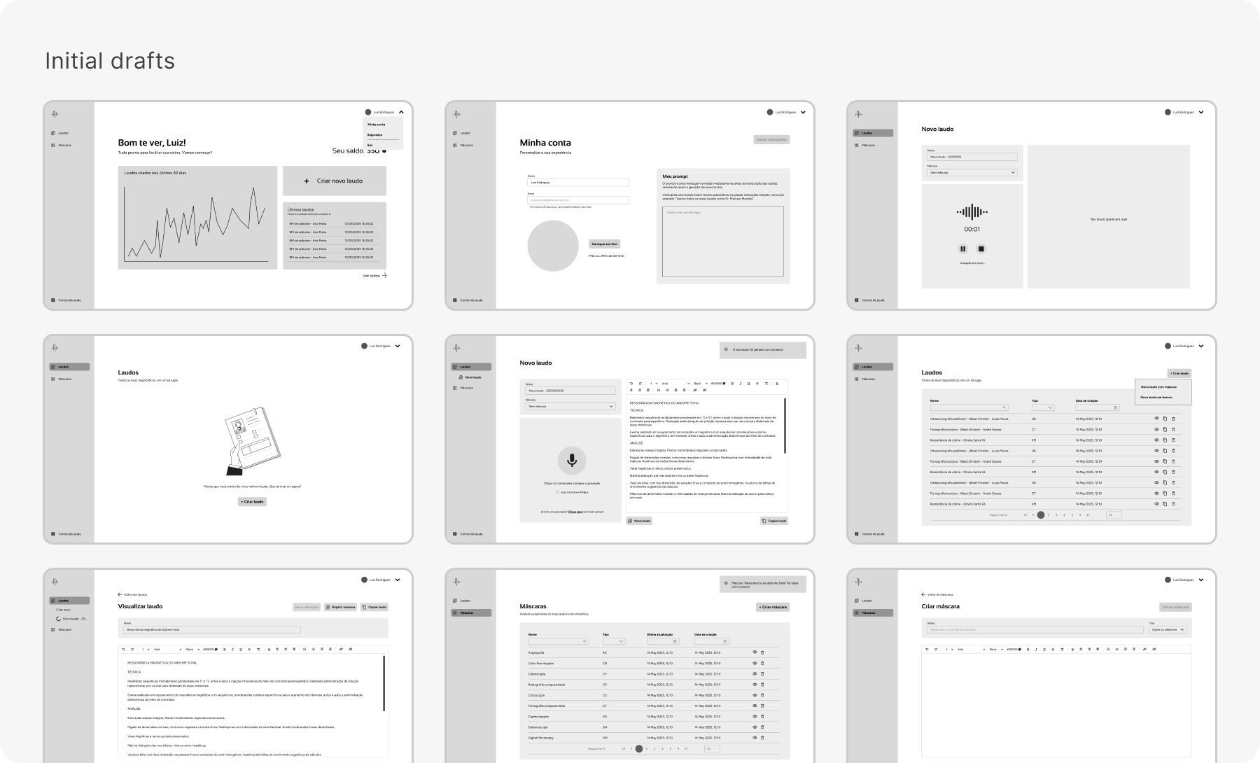
The first step was redefining the information architecture to make navigation more intuitive and reduce friction in critical workflows.I then drafted low-fidelity wireframes to visualize user journeys and test the new structure. This stage focused on simplifying repetitive actions, clarifying task hierarchy, and improving feedback mechanisms to create a smoother, more predictable experience for users.
07
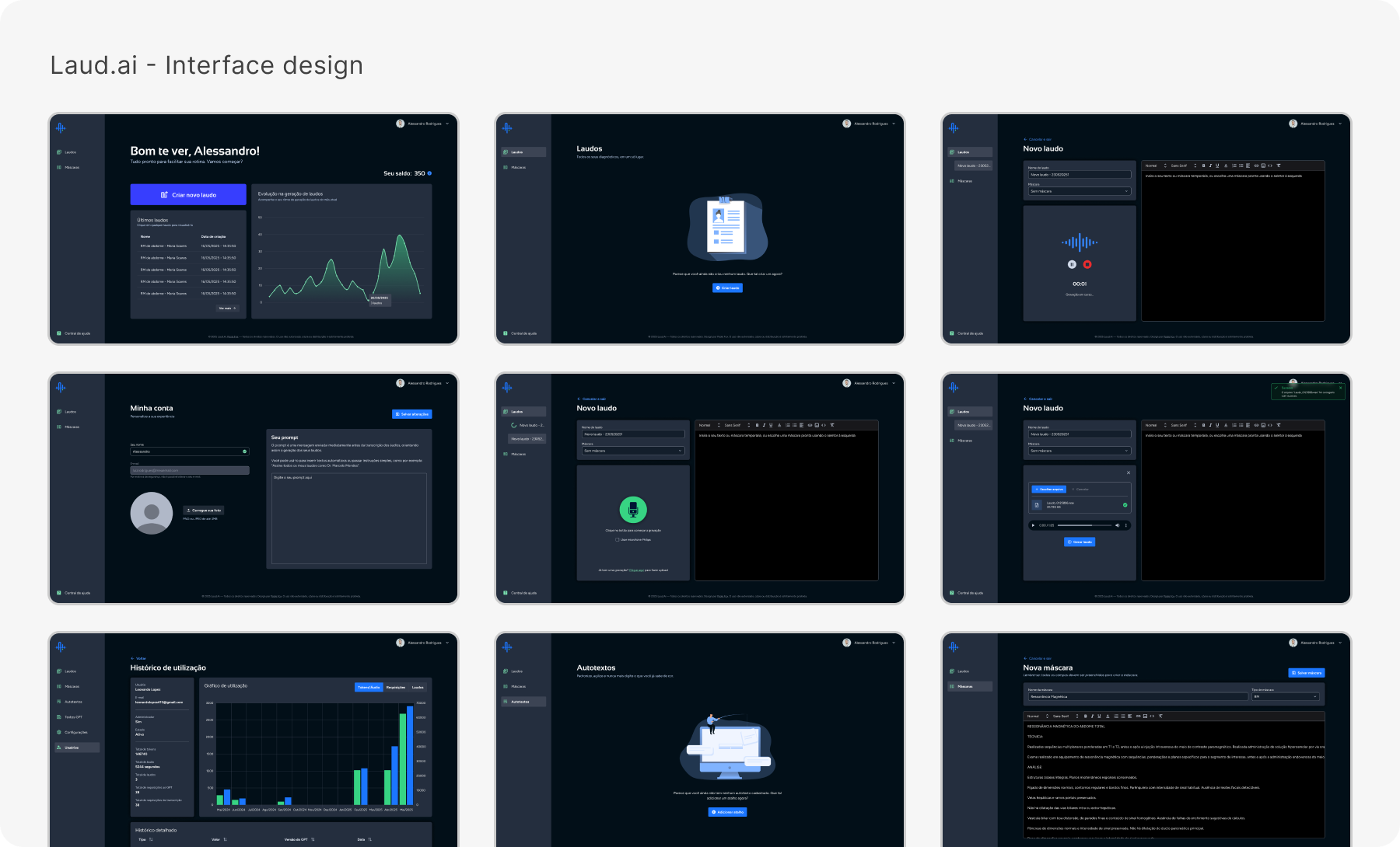
High fidelity and deliverables
Once the structure and flows were validated, I moved into high-fidelity design, translating functionality into a cohesive visual language. This stage focused on clarity, accessibility, and alignment with the previously defined brand identity.
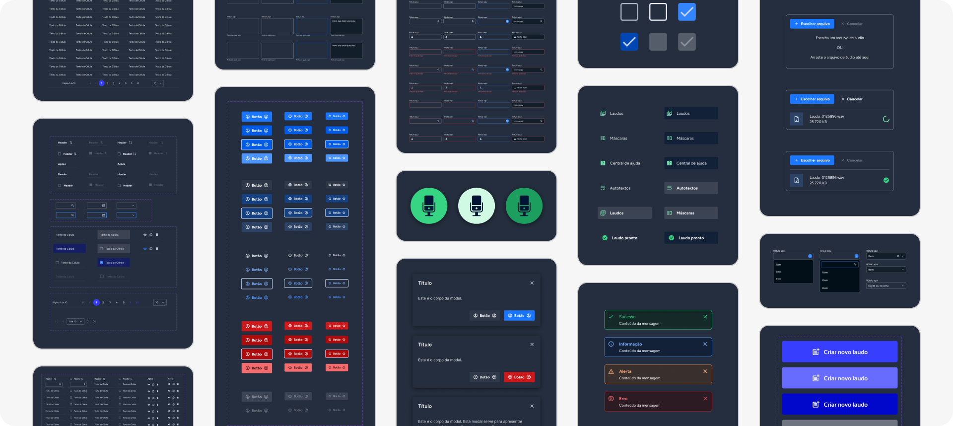
To ensure consistency and scalability, I developed a modular design system built on atomic principles, defining reusable components such as buttons, forms, tables, and notifications. Each element was refined for visual consistency, hierarchy, and ease of use, making sure that the interface felt intuitive and coherent across all screens.
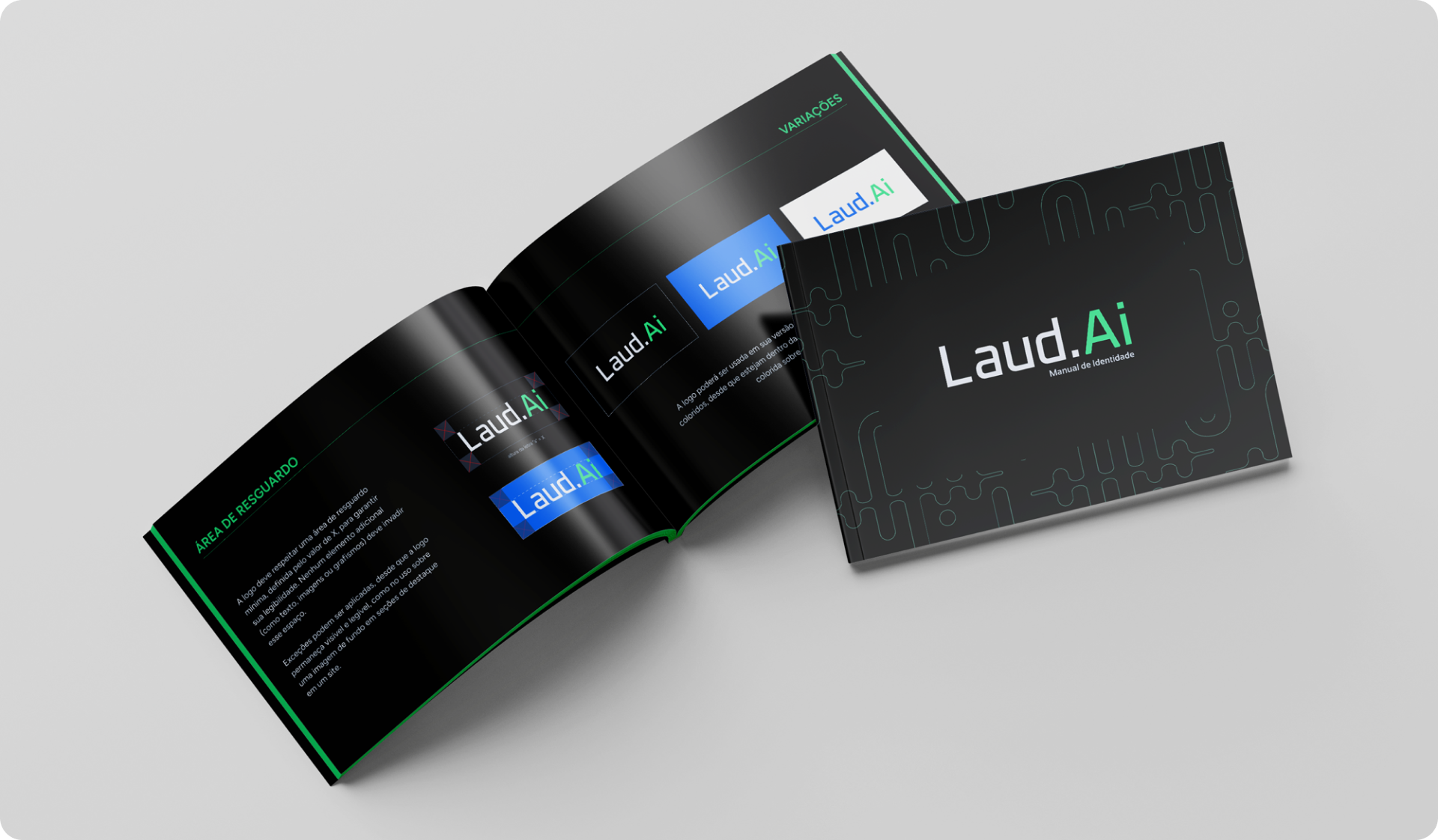
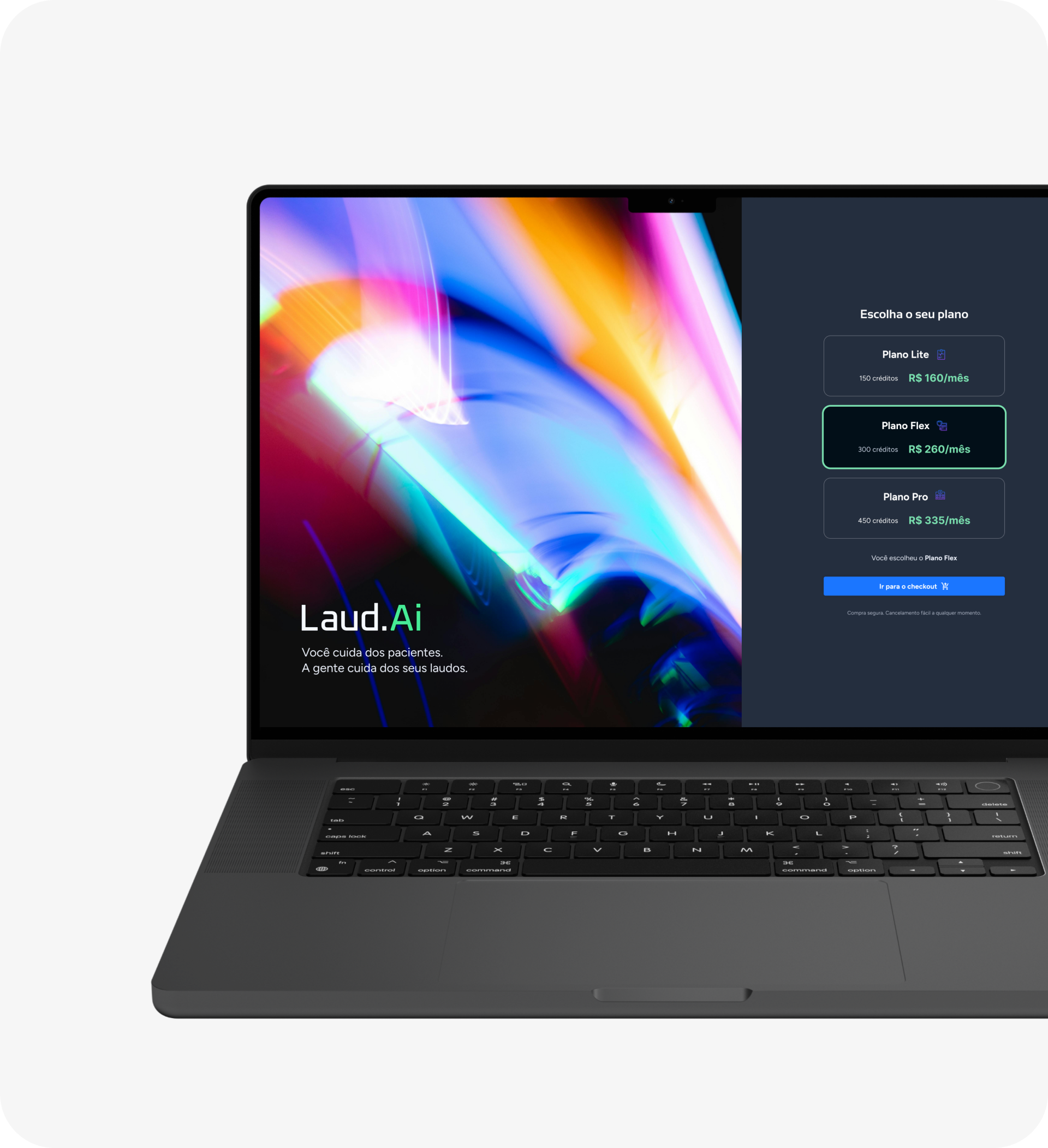
Alongside the complete platform design, I also delivered a branding manual to consolidate visual guidelines and tone of communication, and a polished landing page to introduce the product to its audience and communicate its value with clarity and impact.
The result was a unified design ecosystem that connected brand, product, and user experience under a single, consistent visual language.